
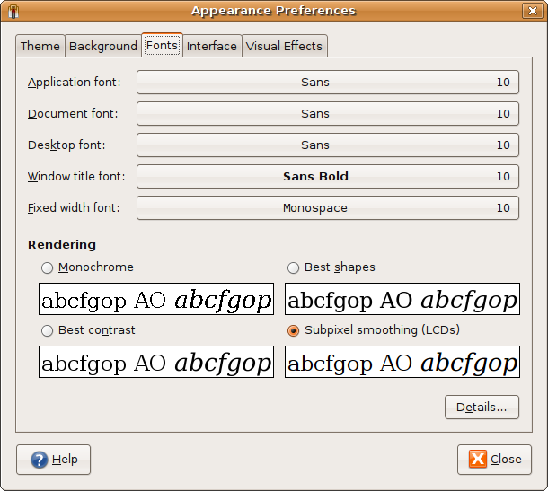
Ubuntu, so Gnome desktop. Check this out with your zoomer.
http://cooklikeyourg.../images/fonts.png
I suspect "best contrast" would look more like what you're seeing on your Mac.

|
Ubuntu, so Gnome desktop. Check this out with your zoomer.
http://cooklikeyourg.../images/fonts.png I suspect "best contrast" would look more like what you're seeing on your Mac. --
Drew |
|
|
(Saved for other comparos)
Zoomed ridiculously, clearly the contrast Is higher for the 'assembled pixel-blocks', but the smoothed sample reveals its method: can see the use of color to smooth via illusion; clever lads.. Smooth beats highest-contrast, yet from one angle, technically: via added-fuzziness! This font display shows it perfectly. Thanks |
|
|
You need to select the right font names in there...
Those is just the default fonts that come with Gnome. http://www.gregfolke...nt-Selections.png And Remember... these are taken at 72dpi... being the default for the screen capture stuffs. |
|
|
I mostly use Firefox and Gimp on this lappy, so I forgot to set the desktop defaults to Bitstream after my last reload. Thanks for the reminder.
--
Drew |