Sorry, as Alex said in a reply to Box, "Couldn't resist".
:-)

|
Sorry, as Alex said in a reply to Box, "Couldn't resist".
:-) |
|
|
|
|
|
--
Drew |
|
|
While I, too did not see what you described ... used the bitchin Zoom-thingy to peer at fonts:
it appears to my un- typographically-tutored eyeballs that Your fonts are more, er granular than even the super-sharp iMac ones. That is, the apparent-sharpness of the black/white edges prolly goes to iMac, but: there seem to be more 'elements' (lines, curves) -per-character to yours! (iMac default that is; dunno what else might improve on that. Yet.) I expect that Peter and others have some views on which be the bitchinest fonts ... to use a technical term which only we epicures know. Posit: Apparently the eye/brain weights the really-sharp edge contrast higher than the actual %linear-fill of a given character ?? (I still need to sort out preferred sizes, font choices and other trivia which, together gilds the lily to a fare-thee-well. Poco á poco.) |
|
|
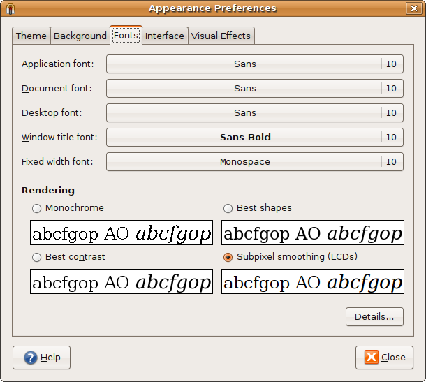
Ubuntu, so Gnome desktop. Check this out with your zoomer.
http://cooklikeyourg.../images/fonts.png I suspect "best contrast" would look more like what you're seeing on your Mac. --
Drew |
|
|
(Saved for other comparos)
Zoomed ridiculously, clearly the contrast Is higher for the 'assembled pixel-blocks', but the smoothed sample reveals its method: can see the use of color to smooth via illusion; clever lads.. Smooth beats highest-contrast, yet from one angle, technically: via added-fuzziness! This font display shows it perfectly. Thanks |
|
|
You need to select the right font names in there...
Those is just the default fonts that come with Gnome. http://www.gregfolke...nt-Selections.png And Remember... these are taken at 72dpi... being the default for the screen capture stuffs. |
|
|
I mostly use Firefox and Gimp on this lappy, so I forgot to set the desktop defaults to Bitstream after my last reload. Thanks for the reminder.
--
Drew |
